

Color Story: Citron
It’s here! Our second Color Story… and this one is packed! Learn all about our featured color, Citron, plus a little lesson in color theory AND some of the amazing Design Challenge entries from July! Enjoy!

but first. . .
A mini course on Color Theory
A basic understanding of how colors work can have a huge impact on design. So, this week before we get to our Color Story, I would like to introduce you to a few basic guidelines and principles of Color Theory!
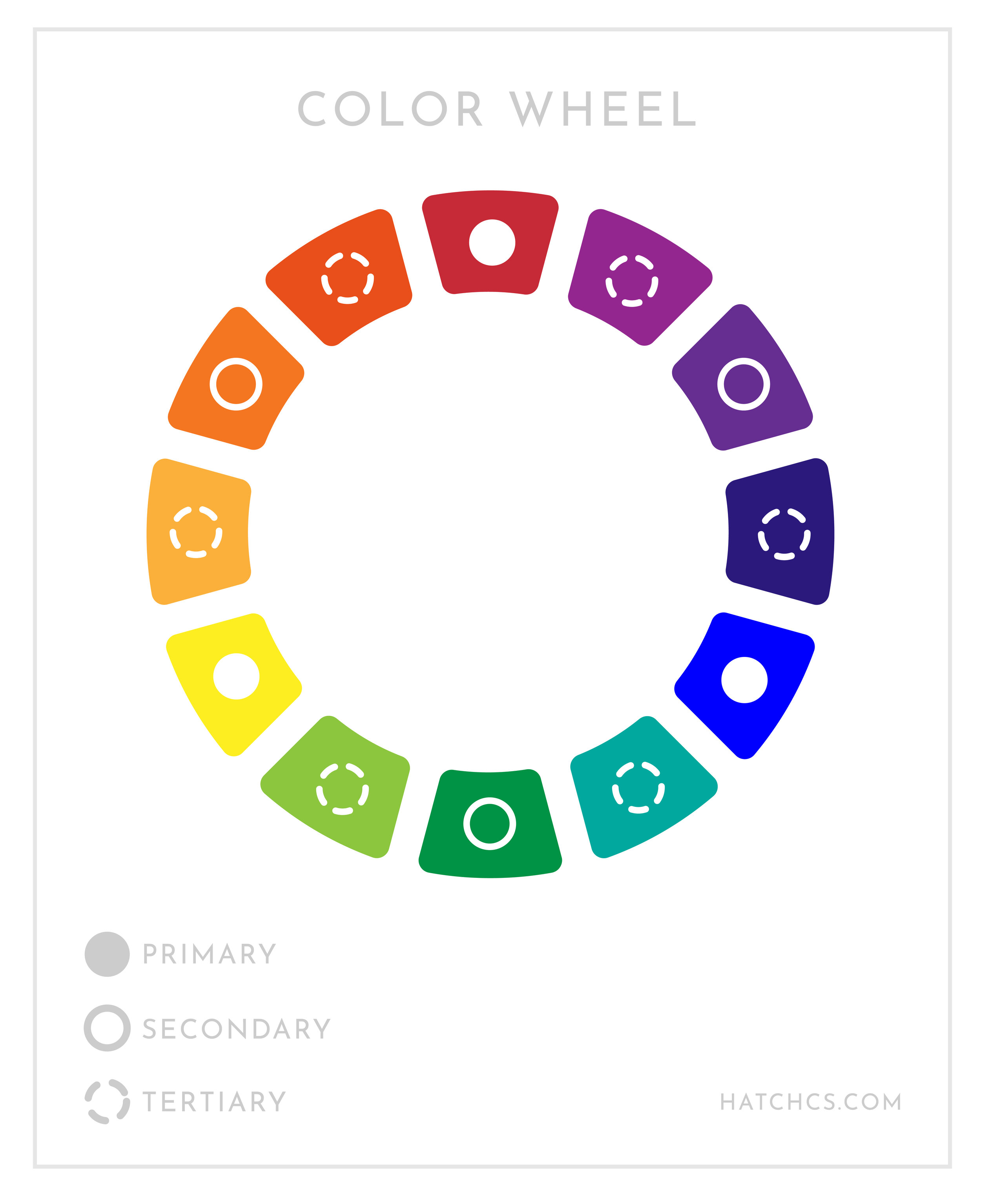
The Color Wheel
As rudimentary as it may seem, the color wheel is truly the foundation of Color Theory as it informs us of many larger principles such as the hierarchy of colors, color relationships, and color temperature. Woah! Doesn’t seem so basic now!
Without delving too deep right away, let’s just start with the core terms: primary, secondary, and tertiary colors.
Primary Colors
Yellow, Red, and Blue. These are the baseline when it comes to mixing colors. What makes primary colors so unique is that they a) can not be created by any other color and b) when mixed together, they can create just about every other color.
secondary colors
Orange, Green, and Violet. Secondary colors are created by mixing two neighboring primary colors. For example, yellow and red make orange. Yeah, I know, very basic. But! The better we comprehend the simple parts, the easier it is to understand the more complex parts of Color Theory. Moving on…
Tertiary Colors
Red-orange, Yellow-orange, Red-violet, Blue-Violet, Blue-green, and Yellow-green. If you didn’t already know, you may have just figured out how these colors come to be. Tertiary colors are formed with any primary is mixed with a neighboring secondary. And while the names aren’t exactly inspired, they combine the two colors that create them with the primary color always listed first..

Now let’s build on those three concepts. Once you identify the hierarchy and placement of each color, you can build a color scheme using Color Harmonies. The graphic above explains several possible harmonies. These color combinations are considered harmonious because of the visual and psychological effect they have when viewed by the human eye.
One of the most commonly used combinations is Complimentary Colors. Two colors are considered complimentary when they are opposite each other on the wheel. You may start to notice how often this Color Harmony is used in designs you see every day!
Changing Hue
The last principle I am going to introduce is different ways to change a specific hue. Learn these terms and BAM you’ll sound like a total pro!

Hue
A color in its most purest form; one that has not be altered and is found on the color wheel.
saturation
This is the intensity of a color. The closer to gray you get, the less saturated a color becomes.
Brightness
Often confused with saturation, a color’s brightness is determined by how dark or light it is.
Bonus: Saturation and brightness can be used together to create infinite variations of a single hue!

TINT
When you add white, you create a tint, making a color lighter.
tone
When you add gray, you create a tone, making a color less saturated.
shade
When you add black, you create a shade, making a color darker.
And there you have it! Some Color Theory basics to level up your next design! See how they come into play below in our August Color Story. . .
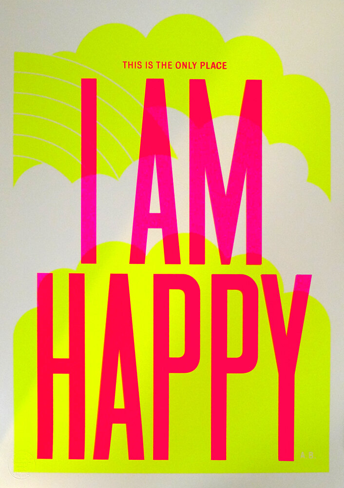
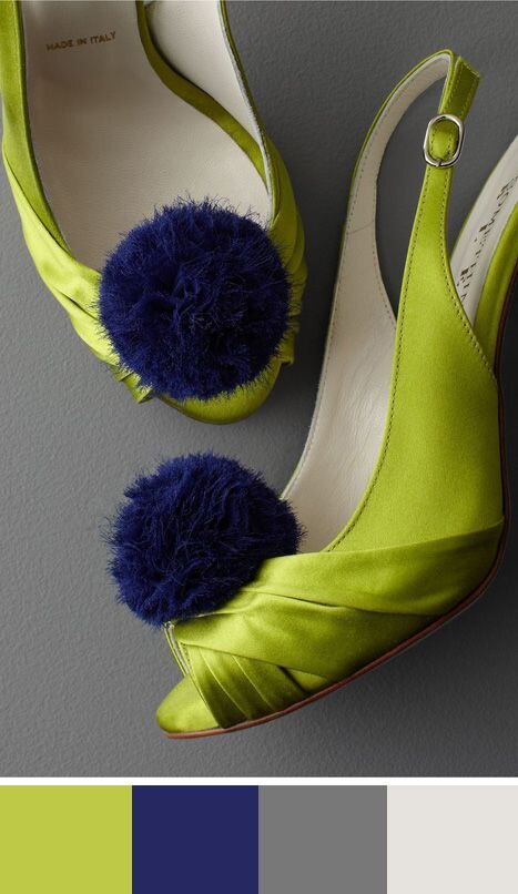
Say hello to CITRON.
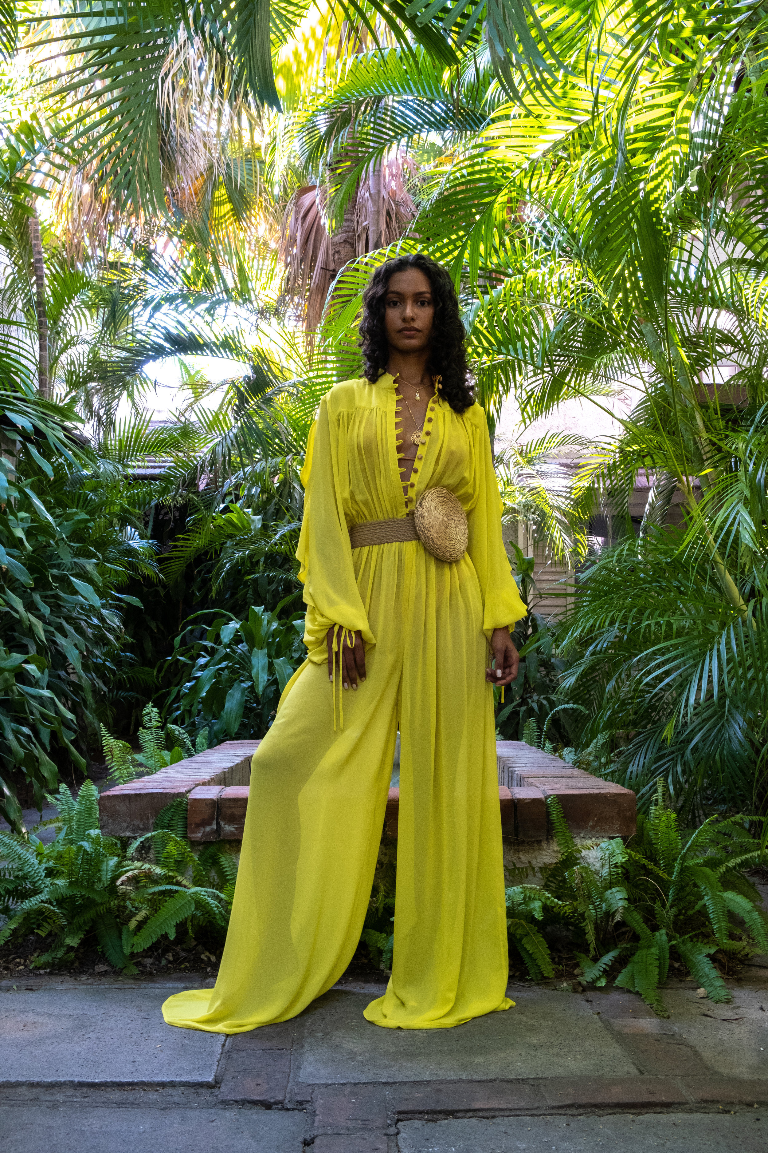
It’s August and in Michigan, we are in the height of our summer season. Long sunny days spent lounging at the beach or watching the stars in the still warm air. And what color could better refresh a hot summer day, like the bright, fruity, ultramodern shade of yellow-green we named Citron.

Citron is closest to yellow-green on the color wheel, with an intensity that makes it look almost neon. It is electric, fresh, and sleek. It can make any design come alive with its cool, acidic glow. Use it in place of lime green to give your design a cutting edge aesthetic.
The name comes from its ambiguous citrus fruit vibe—too green for a proper lemon, yet too yellow for a lime. This ambiguous quality lends itself to the unique and alluring impression that Citron produces.
Citron can be seen in its most vivacious form on digital applications, but because of the purity of its CMYK formula, it definitely holds its own in print design as well.
CITRON MOOD
This color is getting some major love this year in all areas of design, but especially on the runway and in the interior design world. I have seen it used over and over for flowing summer dresses alongside other hot, saturated fashions. It’s also a current favorite for a front door color due to the comeback of Mid-Century Modern home design.
This color is bright, ultramodern, acidic, and distinctive.

“To show my true colors / I must first be exposed to the light”
COLOR PALETTES

MOD CITRUS
This color just begs to be the center of attention! Surround Citron with cool dark grays and a hint of icy blue to show off its citrus-y goodness.
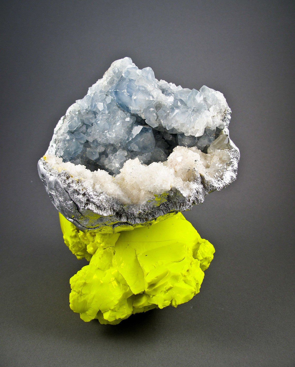
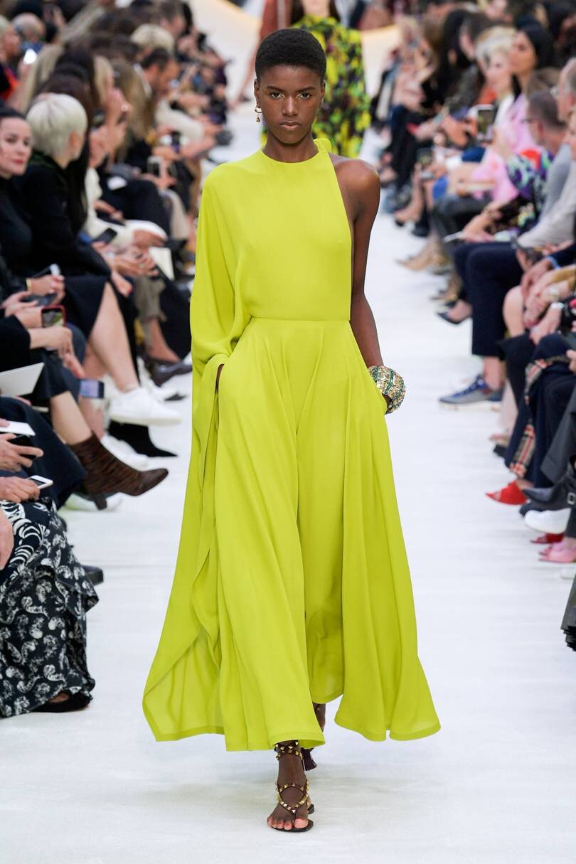
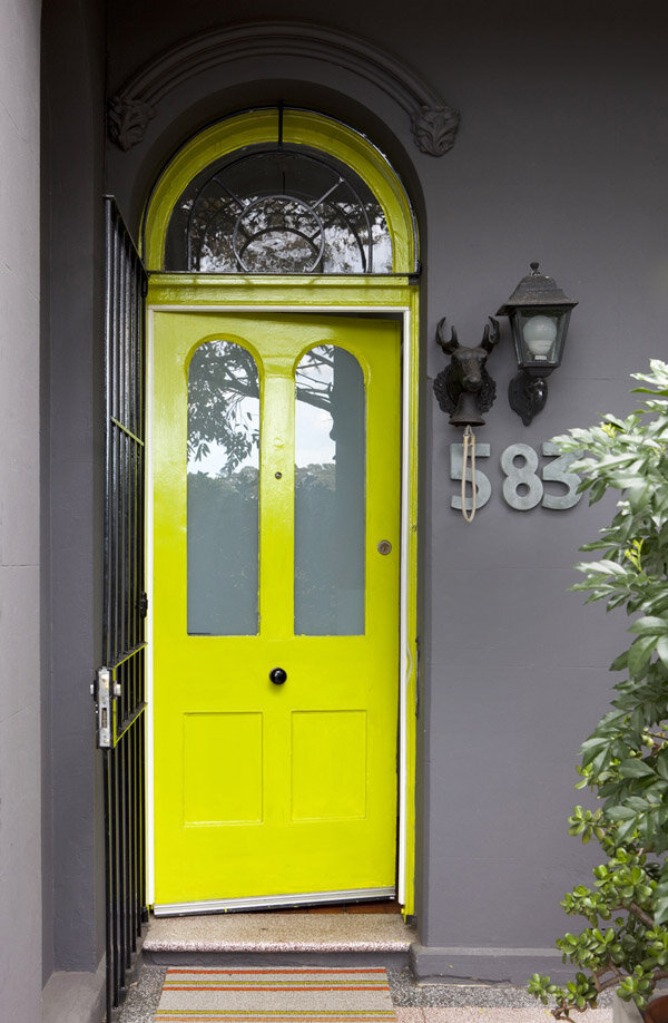
Inspiration Image Credit (L to R): Debra Baxter; Valentino; The Design Files; Oksal Yesilok

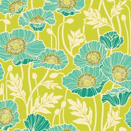
FRESH TROPICS
This bright yellow-green loves to be with other shades of green. Like the canopy of a rainforest, this color is reminiscent of sun rays filtered through tropical foliage. Throw in a splash of pink, and you’ve got a fresh, vibrant color palette just waiting to be seen!
Inspiration Image Credit (L to R): Jennifer Sanchez; Emily Kinsella; Anthony Burrill; Jae Jolly

CHARTREUSE CRUSH
A throw-back to the 1970s, this palette is simply delicious. Balance the brightness of Citron with deep navy, aqua blue, and avocado for a invigorating vintage vibe.
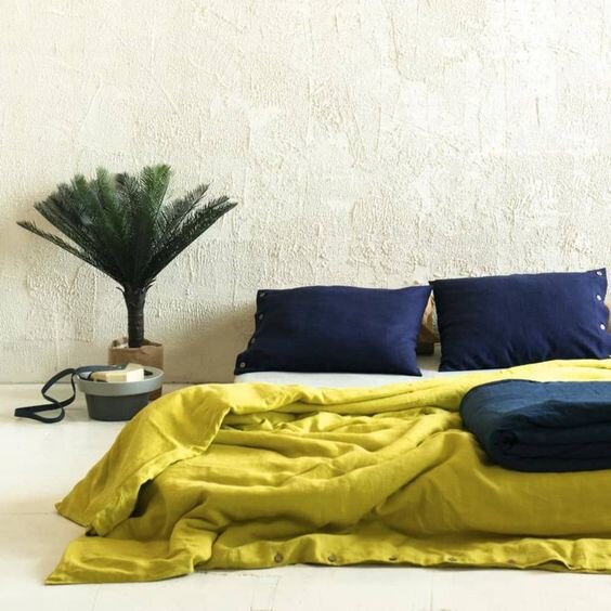
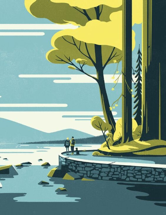
Inspiration Image Credit (L to R): LovelyHomeIdea on Etsy; Tom Haugomat for Stanley Park Brewing; Joel Dewberry fabric design; IntimateWeddings.com
Craving more Citron inspo?
CLICK HERE TO SEE our CITRON Pinterest boarD

#theyolkCITRON
Citron
Color Formulas
HEX #D7E200
RGB 215, 226, 0
CMYK 24, 0, 100, 0
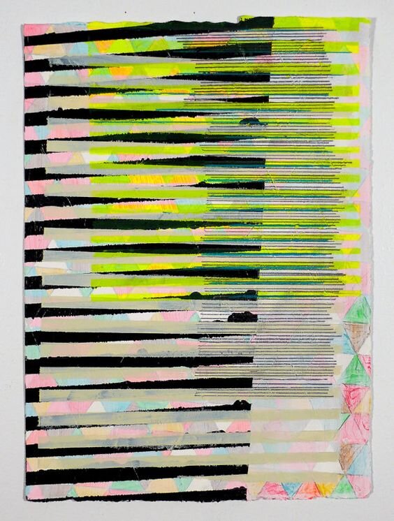
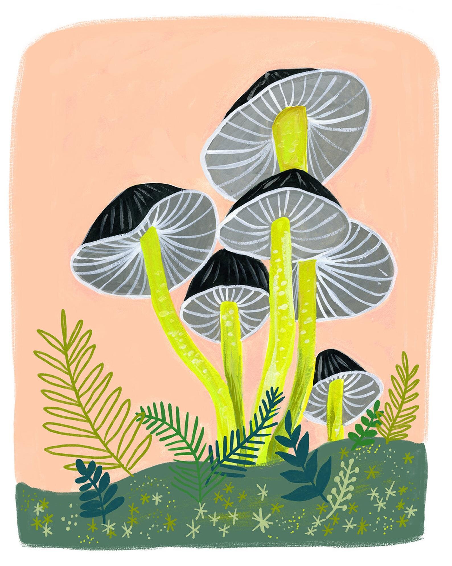
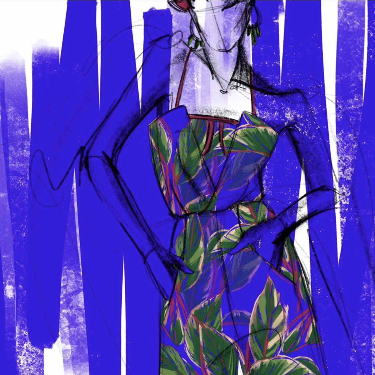
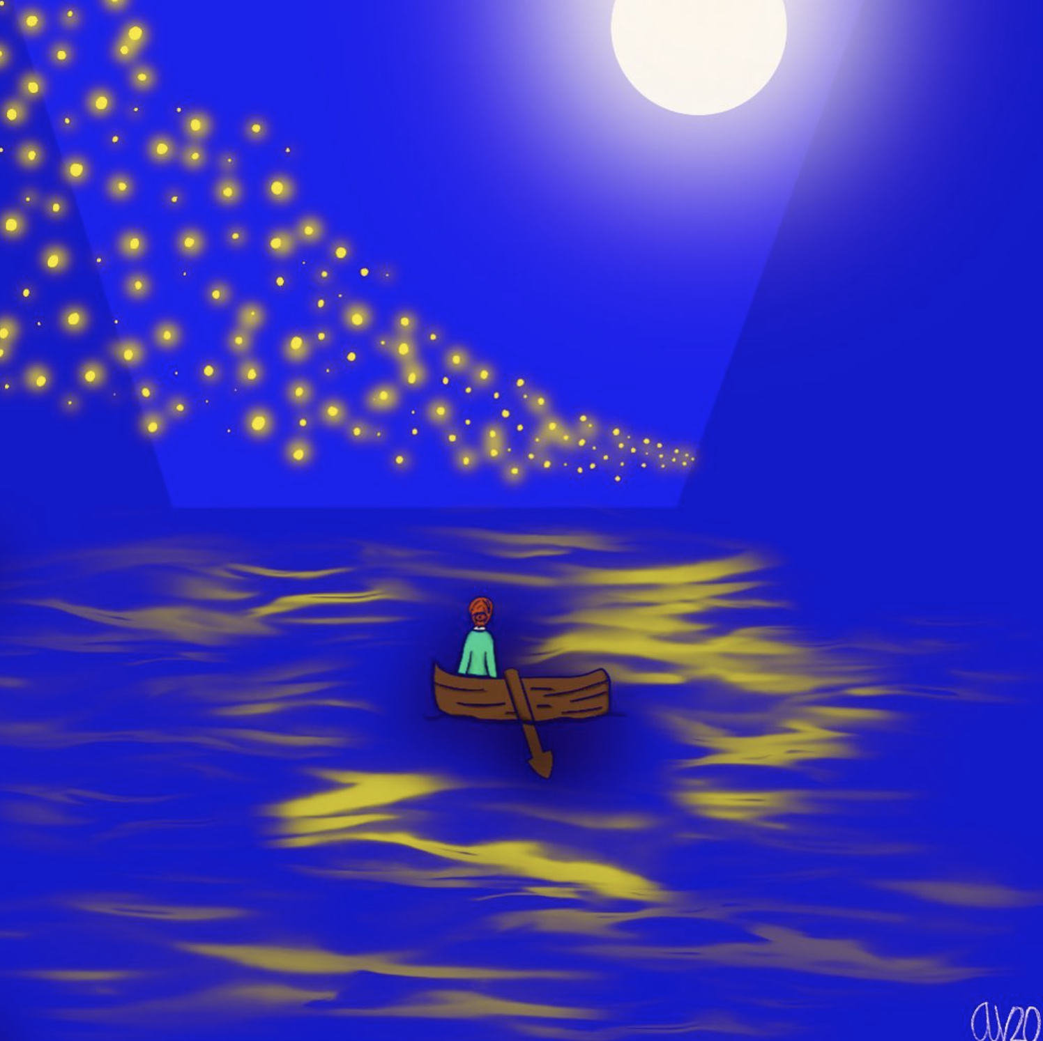
Our second DESIGN CHALLENGE is here! Create a piece of art in a square format, featuring the monthly color, and post to Instagram using the tags @hatchcreativeservices and #theyolkcitron to enter the challenge!**
August’s color story is all about the ultramodern lemon-lime, Citron, so make sure it has the spotlight in your piece. To kick things off, Bre and I took on Citron with a couple of our own digital illustrations. We can’t wait to see what you come up with!
New Color Story at the beginning of each month!
Full details on our Monthly Design Challenge, including instruction on how to participate, are listed below.


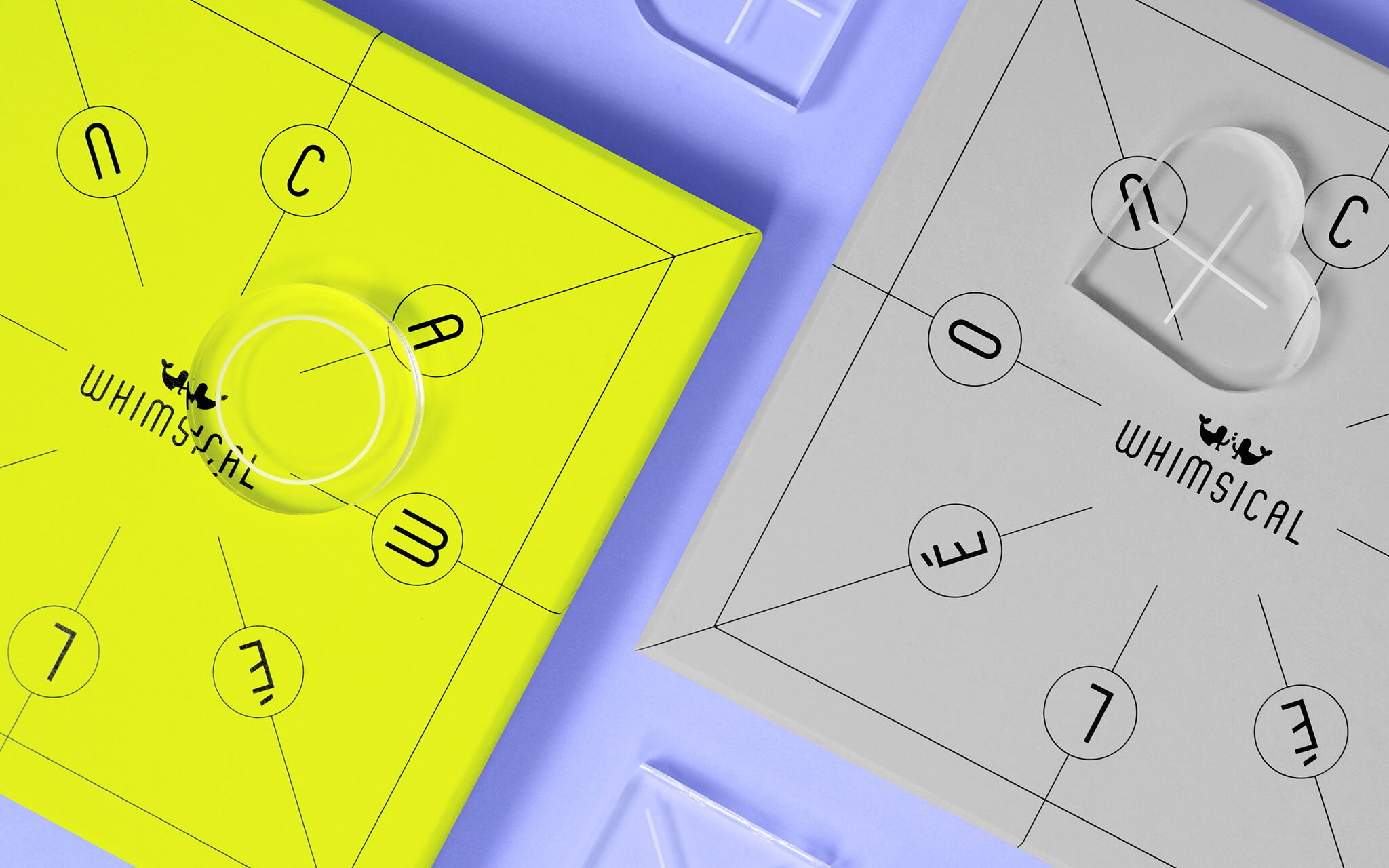
Check out these awesome entries from last month’s challenge, #TheYolkMelodrama
click on any of the images below to check out the artist’s instagram


Design Challenge Deets
**Please read the following carefully.
By tagging your piece on Instagram as part of the design challenge, you are agreeing to allow Hatch to use your image in a future blog post and/or other blog promotions with credit listed in the form of your Instagram username. Complete challenge instructions and disclaimers are as follows:
How the challenge works:
Each month we will unveil the color of the month, just as we did here.
We’ll give you tons of info and inspo (aka: inspiration) to get you started.
Then YOU will create a square design, illustration, or any form of art featuring that color.
Post it to Instagram by the end of the month! Make sure to tag Hatch @hatchcreativeservices and use that color’s unique “color coded” hashtag so we can find your entry. August’s hashtag is #THEYOLKCITRON
We will review all of the entries and pick a few favorites to be featured in the next month’s Color Story post!
DISCLAIMErs
The Yolk Color Story Design Challenge is FREE to enter. There are no fees, forms, or other requirements to submit an entry.
This is a friendly, creative design challenge open to anyone who wants to participate.
A number of entries will be selected by Hatch to be featured in the next month’s Color Story. There are no prizes or other incentives. Just the sweet, sweet feeling of creating art and connecting with other creatives.
This design challenge, Hatch, The Yolk, or any of our collective entities, are in no way sponsored, endorsed, or administrated by, or associated with, Instagram.