
Exhibition Review: Louise Lawler at The Museum of Modern Art

Louise Lawler. Twice Untitled. 2004/2005. Silver dye bleach print, 34 ½ x 30 in. (87.6 x 76.2 cm). Courtesy the artist and Metro Pictures. © 2017 Louise Lawler
Written by Liz Von Klemperer
Louise Lawler is an artist’s artist. By photographing works of art in galleries, lavish houses, and storage containers alike, Lawler captures art in its myriad habitats. What results is a wholly Meta experience, in which the viewer witnesses Lawler’s witnessing of art. As a member of the Pictures Generation, a group that appropriated images from media and consumer culture in the late 1970’s and 80’s, Lawler has turned her lens on the artist’s product. During her 40-year career she has consistently questioned the true value of art as well as the validity of the fine art world. Her subsequent MoMa retrospective Why Pictures Now, on view until July 30, truly subverts the viewer’s expectation of what art can be.
Why Pictures Now features four distinctive components: Lawler’s photographs, memorabilia from past shows, murals of adjust-to-fit works, and blown up tracings of her photographs. The setup is both austere and intimate. While the viewer often must traverse wide gaps of space to arrive at a new piece, a cluster of chairs are also provided for visitors to convene. Glass cases of memorabilia such as matchbooks and flyers require the viewer to almost press their nose to the glass to read small print. This effect is also achieved with her paperweights, which are displayed on pedestals and feature shrunken replications of her photographs. To see the image inside the glass globe one must hover over the pedestal. Conversely, to take in her adjust-to-fit murals, which take up entire gallery walls, one must stand at a significant remove from the piece. This produces a telescoping effect, in which the viewer shifts between micro and the macroscopic versions of the same image. For example, her piece Salon Hodler documents the salon of a prominent collector and is featured as a photograph, a paperweight, and a blown up tracing.

Louise Lawler. Salon Hodler. 1992/1993. Silver dye bleach print, 47 7/8 x 57 ½ in. (121.6 x 146.1 cm). Courtesy the artist and Metro Pictures. © 2017 Louise Lawler

Louise Lawler. Untitled (Salon Hodler). 1992. Paperweight (silver dye bleach print, crystal, felt) with text on wall (not shown), paperweight: 2 in. (5.1 cm) high, 3 ½ in. (8.9 cm) diam. Courtesy the artist and Metro Pictures. © 2017 Louise Lawler
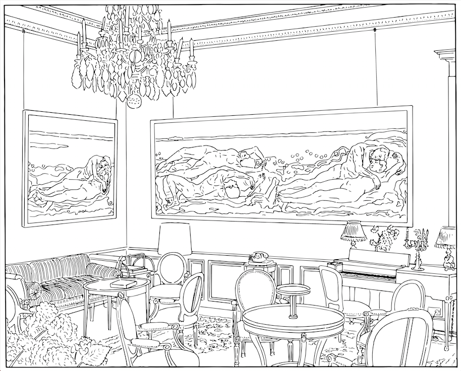
Louise Lawler. Salon Hodler (traced). 1992/1993/2013. Dimensions variable. Courtesy the artist and Metro Pictures. © 2017 Louise Lawler
Not only does Lawler appropriate images of artists such as Andy Warhol, she then appropriates her own images and transforms them into disposable, pedestrian objects. Her 1978 piece Untitled Red/Blue, for example, are two 26-page books arbitrarily priced at $7.95 and $100. This piece calls attention to the absurdity of attributing cost to art. Her books are simultaneously worth little in that they are made of paper, a cheap and easily attained resource. At the same time they are more than the sum of their parts, as the ideas they contain have value.

Louise Lawler. Untitled, Red/Blue. 1978. Printed books, each: 6 15/16 x 4 15/16 in. (17.6 x 12.5 cm). Courtesy the artist and Metro Pictures. © 2017 Louise Lawler
Lawler also plays with the distinction between object and art with her matchbooks, which were produced in 1991 for the Carnegie International in Pittsburgh and feature a quotation from Gustave Le Bon’s book The Crowd. The matchbook is a functional object and can be consumed, but it is also an art object, as it is presented in a gallery setting. Across the room her more recent 2004/2005 photograph Twice Untitled shows two works of art turned against a wall, with only the backing exposed. From the late ‘70s, to the ‘90s, to today, Lawler casts her gaze onto the construction of the image instead of the image itself. This tongue and cheek, gently mocking tone is a through line that ties her retrospective together.

Louise Lawler. Matchbook for Carnegie International 1991, Carnegie Museum of Art, Pittsburgh, 1991. Printed matchbook, closed: 2 x 1 13/16 in. (5.1 x 4.6 cm). Courtesy the artist and Metro Pictures. © 2017 Louise Lawler
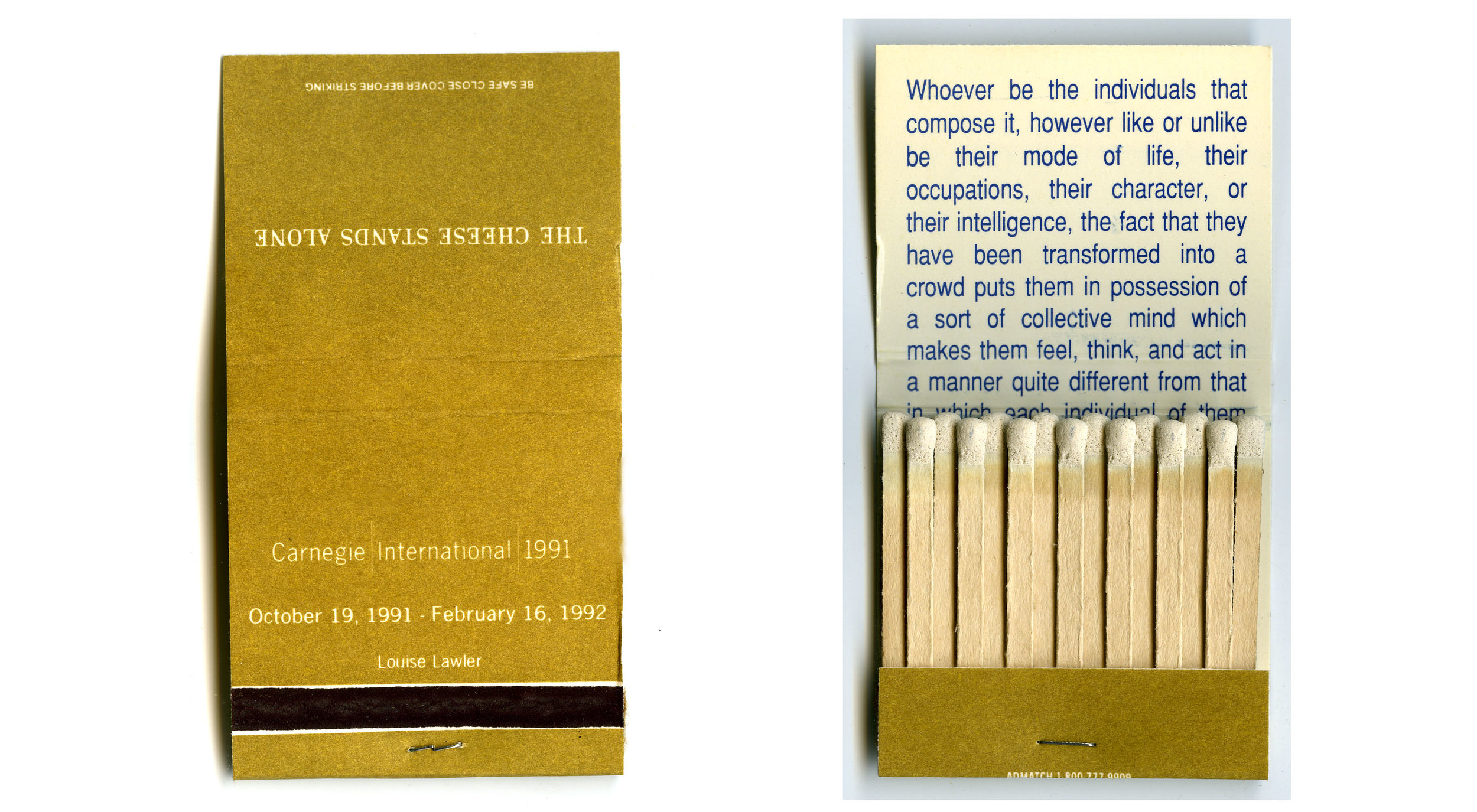
Louise Lawler. Matchbook for Carnegie International 1991, Carnegie Museum of Art, Pittsburgh, 1991. Printed matchbook, closed: 2 x 1 13/16 in. (5.1 x 4.6 cm). Courtesy the artist and Metro Pictures. © 2017 Louise Lawler
Lawler is bent on subversion, and on creating work that forces the art world to see it’s idiosyncrasies and hifalutin tendencies. Ironically, the very institutions that she critiques now celebrate her work. In this sense, the artist walks the fine line of being accepted into the art world while casting a mischievous, lightly mocking gaze onto the world she inhabits.


